Monday, 20 February 2012
New 5 crocodiles page for '40 Elephants'.
I much prefer this to the other crocodiles, they are much better colours, shapes and just in general. Might have to do something about the paler line running through the middle of all of them. I think this is possibly where the two sheets of paper are joined.
Now I need to re-think the Zebra. They're quite clumsy looking and the layout is pretty dull. I think I need to sketch some next time I'm at the zoo so that I can get more movement into the images and make them more exciting...
Wednesday, 8 February 2012
MA Children's Book Illustration Graduation Exhibition 2012.
Please come and see our MA Exhibition, everyone's work looks amazing. Its in Foyles Book Shop (Charing Cross), Wednesday 8th Feb 9am until Tuesday 14th Feb 6pm. Everyone is well come.
'40 Elephants' extended pages 27 & 30
'40 Elephants' pages 24-25
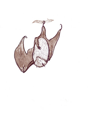
Bat sketches
I spent over 3 hours sketching the bats in their new upgraded eco-tunnel home at Jersey Zoo. It was wonderful to spend so much time with them. I've really missed them since I left the zoo. I decided to substitute the meerkats in '40 Elephants' for Rodrigues Fruit Bats. It was very self indulgent but I wanted to make beautiful prints from my sketches. I also wanted to keep elements of my initial idea of putting unpopular animals in a children's book. The only down side was that meerkats are one species and are easily recognizable so children will already have an idea of their size and scale. This is not so with the bats... oh well...
Lino print cockroaches
This was my first attempt at a print with more than one colour. Also my fist attempt at mixing my own colours (summer 2011) - which took several hours. Thankfully I'm much faster these days. This print started off an idea about an alternative alphabet of unpopular animals which led to the size and scale idea for my masters project '40 elephants'.
Kennel Prints
Dumped
Dumped was created for the sequential image project and taught me a lot about designing a 32 page picture book. I'm generally quite pleased with the outcome, although it is largely unfinished and there are quite a few changes I would like to make to it. I feel a little bit bad that it portrays kennel life so bleakly. Shelter kennels are not a particularly nice place for dogs to live, but they are provided with lots of enrichment devices and bedding to make life more enjoyable. I decided to leave these out because I the print element of the illustration requires simplicity to make the most impact. I feel like I am doing a dis-service to rescue charities, but at the same time I think the desolate isolation of the kennel works very well to emphasize Squids loneliness and isolation.
'Dumped' pages 26-27
'Dumped' pages 22-23
'Dumped' pages 16-17
'Dumped' pages 14-15
'Dumped' pages 12-13
This page still needs a lot of work. I like the idea of the brightly coloured people contrasting against the drabness of the kennel backdrop. The three lines of kennels will eventually show many of the dogs in them being picked by people and taken home, except for Squid, who no one is interested in.
'Dumped' pages 8-9
'Dumped' Cover
Thursday, 2 February 2012
Potato prints and collographs in the sequential image project
I thought about drawing line drawings of dogs underneath but felt that they wouldn't be bold enough and would get lost behind the bars. After some experimentation I decided to use a mixture of ripped cardboard prints for the main characters and potato prints using gouache paint for the rest of the characters. I liked the way the gouche merged with the moisture from the potato to give the dogs more organic markings in contrast to the starkness of their printed outlines.
Subscribe to:
Posts (Atom)